When green stops having meaning.
A vehicle card enhancement that turned into a design system improvement.
My role
Contributions: Color conflict identification, chip color exploration, palette expansion proposal, design system implementation
The ask
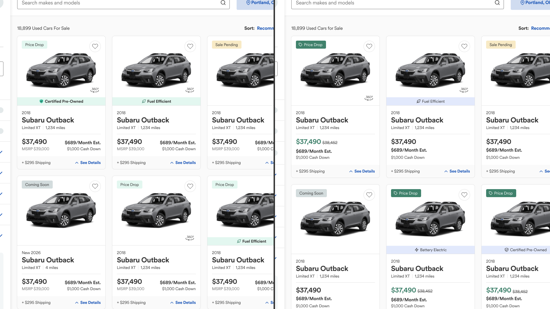
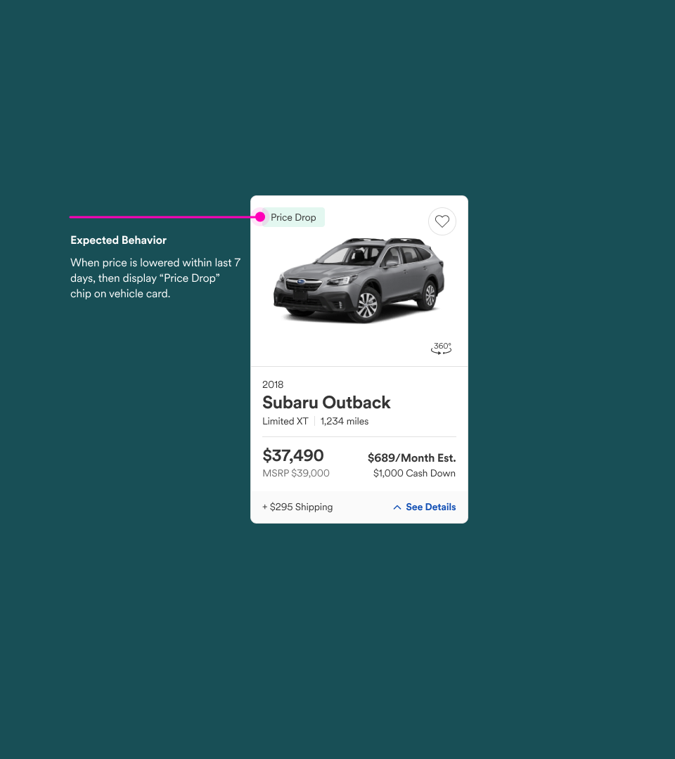
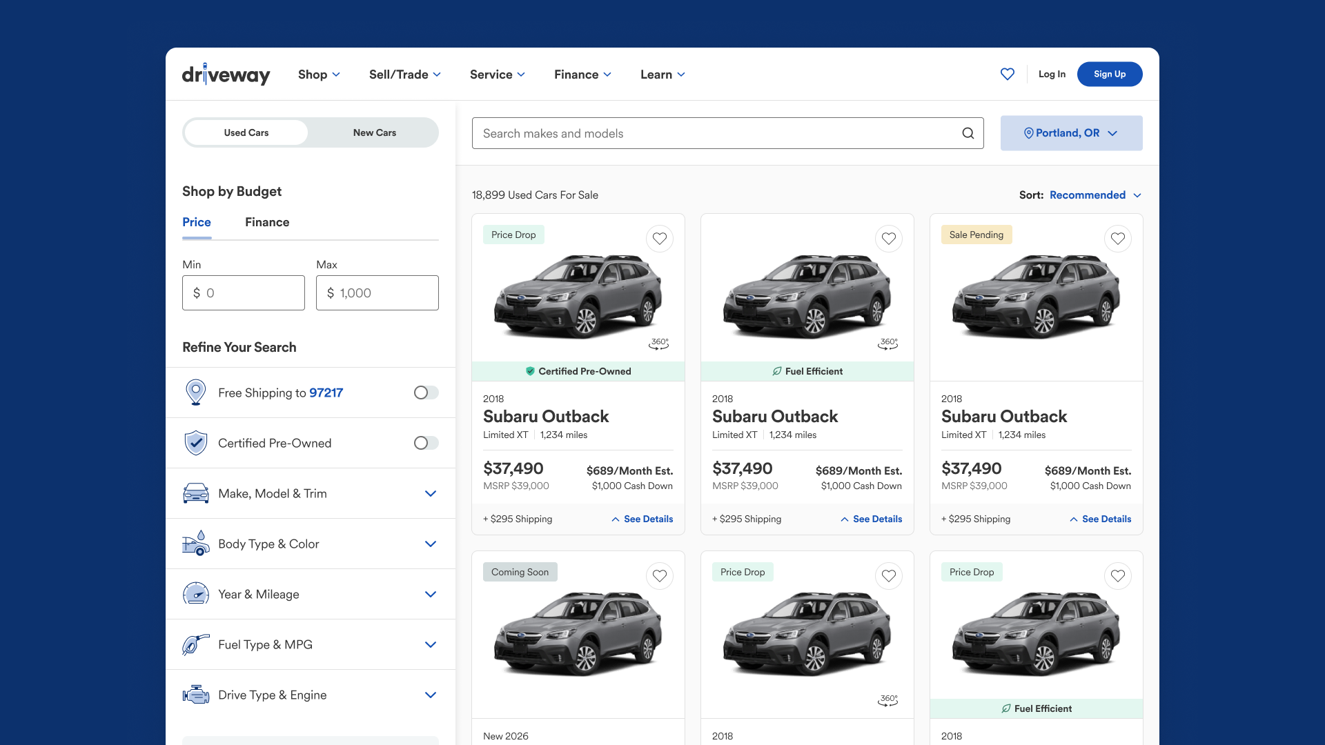
Roughly 30% of used inventory on Driveway qualifies for a price drop at any given time. The business wanted to surface that signal on the vehicle card to motivate customers and increase conversions. Show the customer the price went down, watch them feel good about it, maybe buy a car. Simple enough.
The first pass
The Sr. Designer’s instinct was right: reach for the success variant of the chip component. Green means go. Green means good news. Green means price drop. On paper, correct. In context, a problem we hadn't seen yet.
Ummm…that’s not gonna work
I asked to see the card in context and immediately clocked an issue. Our fuel efficiency banners were using the same green. Price drop was getting lost.
Digging into the fuel banner, it wasn't even doing its job cleanly. That green was being applied to gas fuel-efficient vehicles, certified pre-owned, and a handful of other categories that had nothing to do with eco-anything. The color had been asked to mean too many things, so it had started to mean nothing.
It’s gets worse…
Roughly 8% of men have some form of red/green colorblindness. A price signal that relies on a light green may not be a signal at all for a meaningful portion of our shoppers. The solution had to give the chip more weight, not abandon the color.
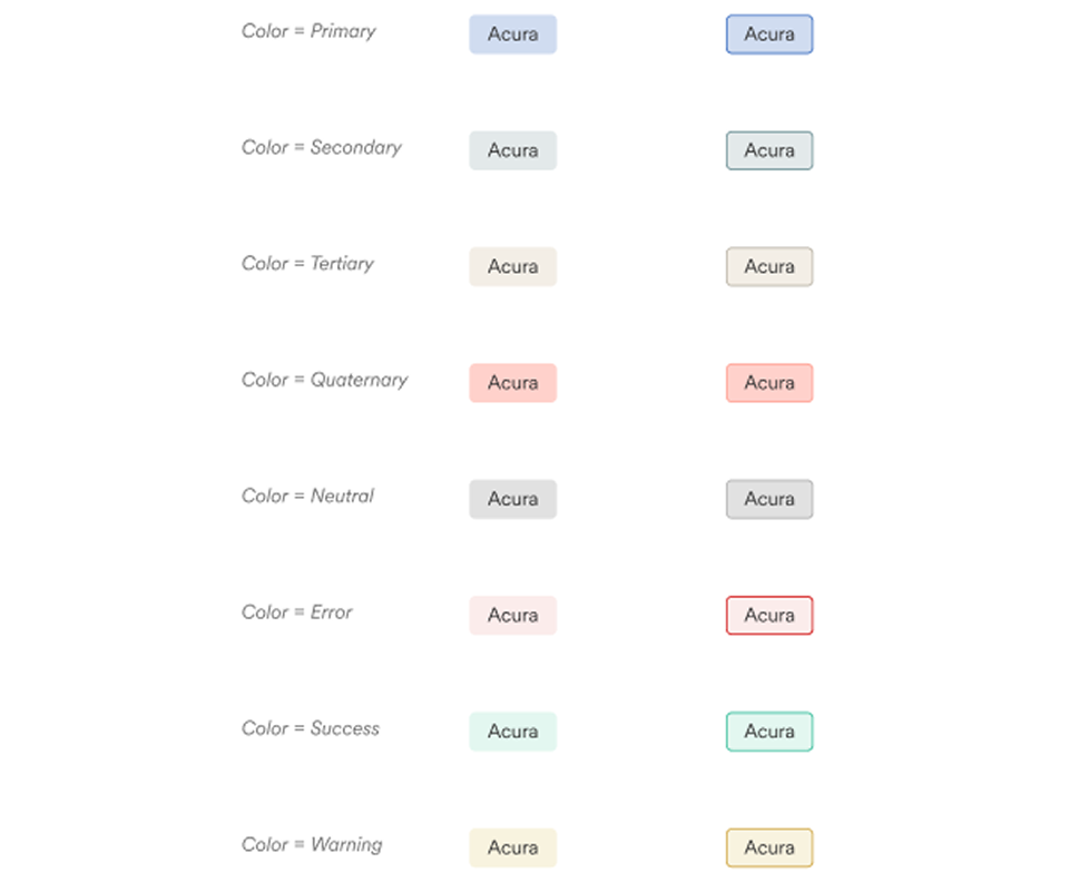
Let’s check the chip component
The chip component only leveraged the lighter spectrum of our color palette which was limiting our ability to add emphasis.
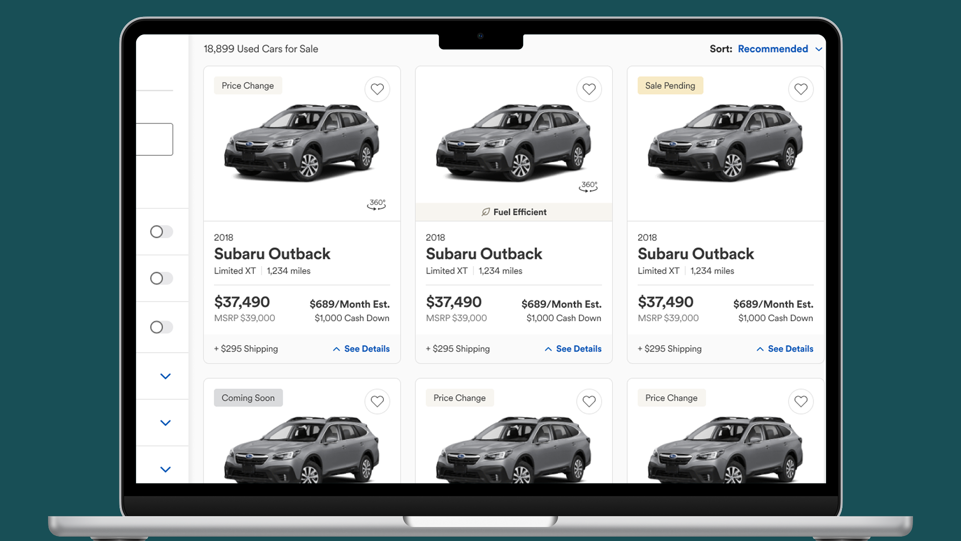
I ran a full exploration of darker chip color variants across the entire palette, looking for a green with enough weight to stand on its own. Separately, I recommended moving the vehicle card banner to a more neutral color. If it's not earning its color, it shouldn't be wearing it.
Then I noticed something else
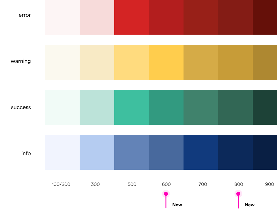
Our feedback palettes (success, warning, error, info) each had only 5 shades, while our brand palettes had 10. That gap was compounding the limitations of our chip component. I proposed adding 2 shades to each feedback palette and worked with the Design System Lead to get the feedback palette and chip component update in the system.
What shipped
A deep green chip that owns the price drop signal clearly. A neutral banner that stops pretending green means something it doesn't. An expanded feedback palette now in the design system, available to every team.
And since the design system absorbed the system updates, the feature scope wasn’t impacted.