Shadows have meaning.
A shadow system with the range to actually work.
My role
Contributions: Elevation system audit, shadow value redesign, depth scale definition, usage guidelines, design system documentation
Elevation was limited in the design system.
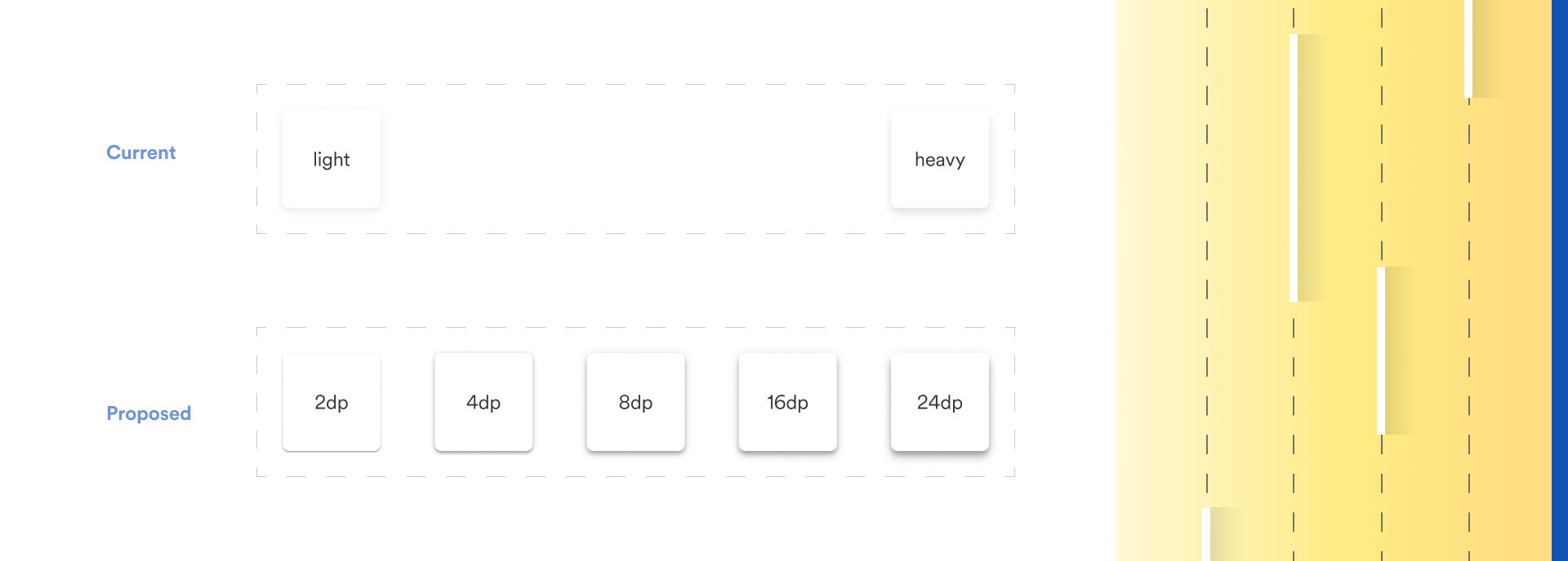
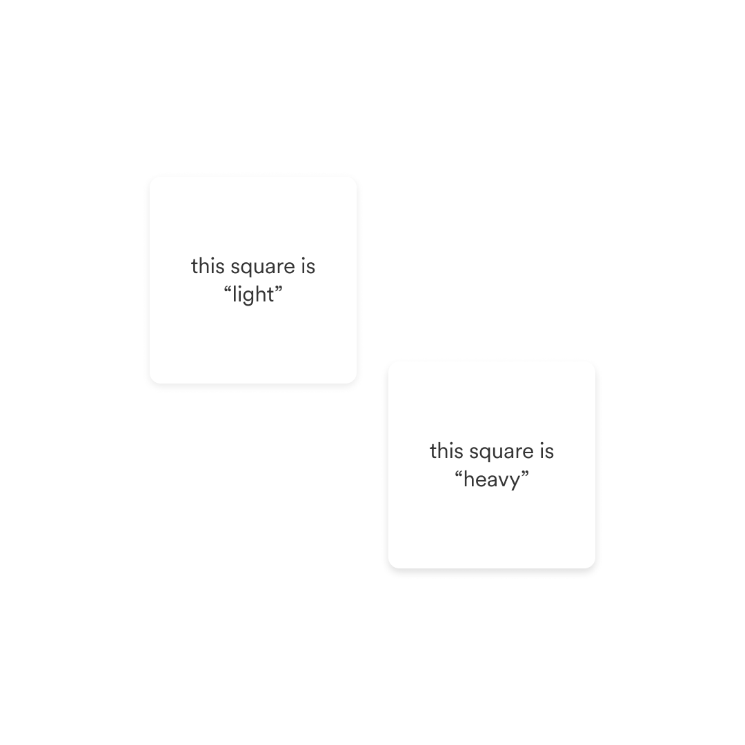
Our elevation system had two named values: light and heavy. On paper, that sounds like a range. In practice, the contrast between them was so low that users and designers alike struggled to perceive the difference. And with only two values, there wasn't enough material to write meaningful usage guidelines. When should you use light? When should you use heavy? The answer was essentially: guess.
Elevation isn't decorative. It tells users where they are in an interface, what's on top of what, and what deserves their attention. A shadow system that can't communicate those things clearly isn't doing its job.
Our starting point with two elevation values.
Well implemented elevation...
Can help convey visual affordance
Offers visual clarity when we layer UI elements
Cues the user to an element’s relationship to the current page
Helps users comprehend how items exist along the z-axis
Improves accessibility
The Material Design approach to shadows.
The fix wasn't just better shadows.
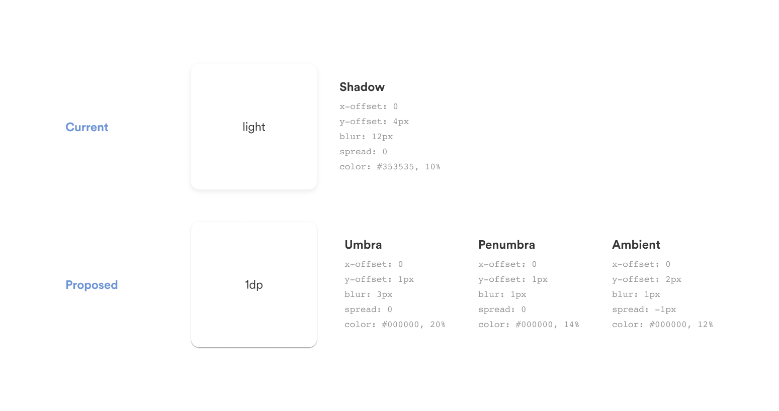
The first thing I changed was how we were building shadows. The existing system used a single shadow layer per value. Real-world light doesn't work that way. I proposed a three-layer model: umbra, penumbra, and ambient—the same approach Material Design uses—which produces shadows that read as natural and credible rather than flat and arbitrary.
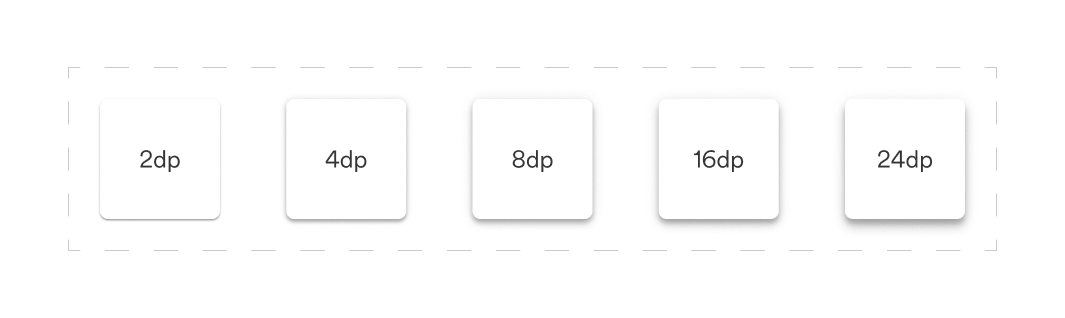
The second thing I changed was the scale. Two values became five, measured in density points rather than subjective descriptors like "light" and "heavy." 2dp, 4dp, 8dp, 16dp, 24dp. Each one visually distinct. Each one with enough separation from the next to actually be useful.
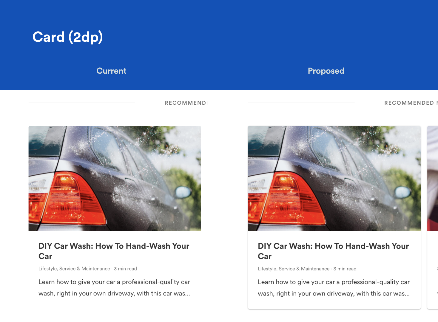
Cards. Left: No shadow, Right: 2pd shadow.
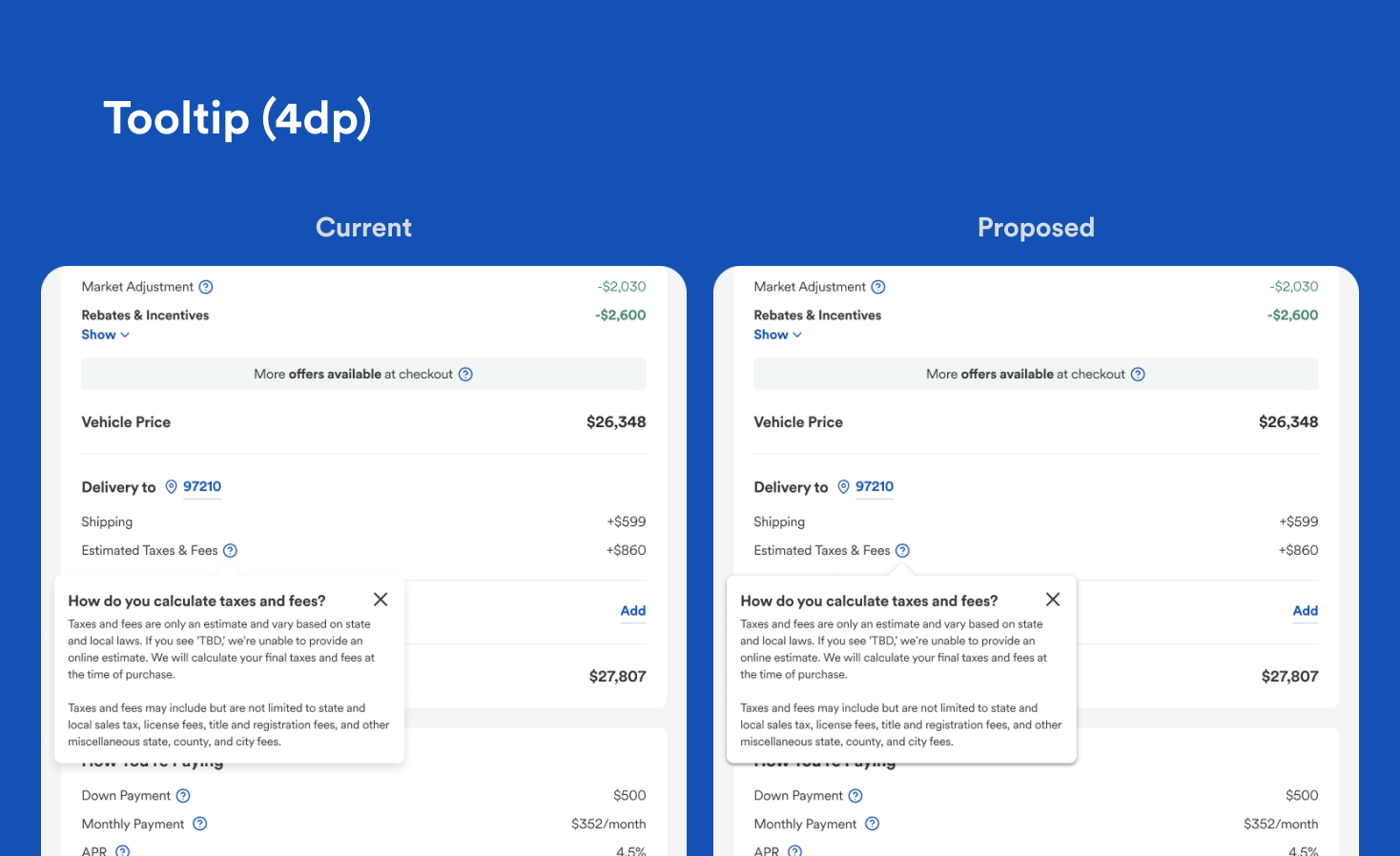
Tooltip. Left: old “light” shadow, Right: new 4dp shadow.
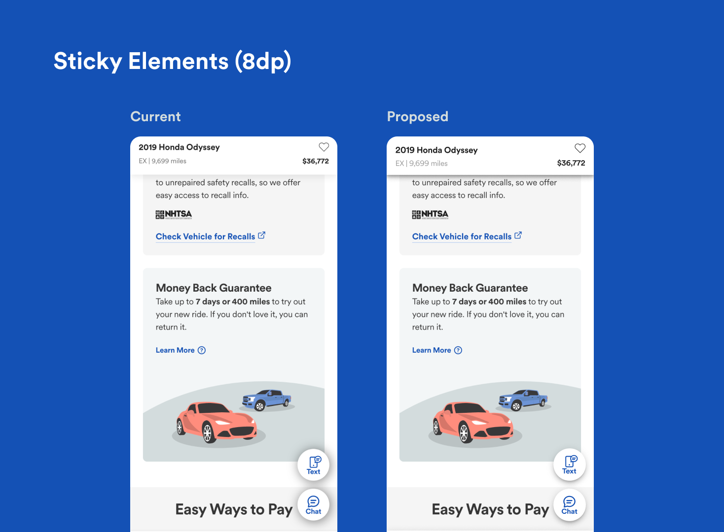
Sticky elements. Left: old “dark” shadow, Right: new 8dp shadow.
A shadow system should answer questions, not create them.
Giving every level a job.
With five values instead of two, usage guidelines became possible. Each elevation level maps to a specific UI behavior:
2dp: cards and on-page elements that sit semi-independently of main content
4dp: sticky elements and toasts with fixed viewport positioning
8dp: toggleable UI triggered by user action - menus, tooltips, dropdowns
16dp: elements that interrupt the experience for urgent actions - drawers, modals
24dp: reserved, undefined, available for future edge cases
The system absorbed the update cleanly. Designers stopped asking which shadow to use because the answer was in the documentation. And the three-layer model meant the values actually looked right in production, not flat, not arbitrary, but credible. The small details are what tell users they're in a product someone cared about